31 July 2022

Is there something in the water??

3 of my favourite challenge sites have challenged us to go nautical or under the sea and AAA have asked for along the edge. 

It makes it semi-easy when you have a brief to fill i.e. the along the edge so I thought I'd mask off the majority of the card front and using my green and blue shimmer powders and create a watery look. As this is CAS I was trying to make a one layer card but I discovered watercolouring on Neenah White is horrendous but I'm sure I can use the scraps to die cut out for some future project. The masking tape didn't even really stick to it properly and so I didn't even get a straight edge. 

I then thought I would try some of the new card stocks I picked up at SENZ and my second attempt is below and I used some Multifarious Lavinia smooth and supreme card which was fab! Looking at the Lavinia web site it says "tried and tested with several mediums. One card that does it all, from Watercolour Inks to stamping. It works with Oxide inks and Brushos beautifully. The perfect card for all your crafting needs." I'll definitely be using it again as it is white where my Strathmore that I love normally is a cream colour

Once it was dried I added a few school of fish and some seaweed and in my box of left over images I also had a left over mermaid and wee fish after I had helped my 2-½ year old granddaughter make a birthday card for her mum who is our family's mermaid being a NZ champ and rep at springboard diving when a teenager. 

At the time we used Strathmore Bristol Smooth card stock and my old Ranger Distress markers which are well and truly past it but reactivated with the aqua painter at the time and made some fun images.

Because my mermaid was a wee bit bigger than my watercoloured panel and I didn't want to cut off some of her hair I cut off ¼" of the RHS of the card front. I actually like having the wee white strip on the LHS. 


Supply List:
Stamps: Mermazing and matching dies (MFT), Whale Done - sentiment (SU!), Mermaids - starfish (HA My Monthly Hero May 2017)
Ink:  Memento Tuxedo Black, Aquamarine (PF), Tidal Pool (PF), Bermuda Bay (SU!), Versamark
Paper: Lavinia Multifarious, Neenah #110 , Bristol Strathmore smooth, Bermuda Bay (SU!)
Other: Ranger distress markers, white embossing powder, clear Wink of Stella, Nuvo shimmer powders (Blue Burst and Atlantis Burst), Ken Oliver Crafts color burst (Turquoise), Tinby Color Crush (Blue Heaven), masking tape


Well if it doesn't stop raining in New Zealand we may all be living under the sea sooner than we expected. Hope the sun is shining where you live!
✿ Karen ✿


27 July 2022

Show us your ...

Christmas Kickstart Challenge want us to show them your snowfolk which ties in well with "show us your money".


Now I think snowman and snow are cute on a card but it's the middle of the summer down under at Christmas time and I live in a part of New Zealand that NEVER snows. So I must admit I do not buy snowmen stamps but one of my oldest stamps that I could not bear to part with is Holiday Lineup from Stampin' Up! which also has a row of cute reindeer and a row of cute elves. Searching my blog I could only find one blog post way back in 2009  which you can see HERE and I still love that money holder card. 

So I thought to myself lets make another money holder card using a new design I learnt a few weeks ago at a class of Kristine McKnickle's

Now Kristine's card is very classy and uses the new Texture Chic suite but what I loved especially was what a great idea the money holder card was.  She basically took one piece of A4 card stock and scored at 9 cm, 18 cm and 27 cm. The wee left over bit is decorated with DSP etc and just the edges of the last fold are attached at the side with strong tape to make the pocket for the money (or gift card). She called it a tri-fold pocket card but to me it's a money holder card because who doesn't like money, I know some great nieces who will appreciate my snowmen card at Christmas

Front of card plus my nearly grown out yucky thumb nail but I am scared as I have a beetroot in my meal kit to use for dinner tonight. Will my thumb and nail survive me peeling it again? I've also used another really old wood mounted stamp set as a tag Spotlight on Christmas


The images have been coloured up with my lightest ZIG real color brush markers and some clear Wink of Stella. I had what looked like a mauve Versacolor ink pad so I thought I'd wipe the edges and then pour on some WOW clear hologram sparkle but it was darker than I wanted and when I read the colour it's actually called smoke blue (oops) but I still think it broke it all up a bit as it was all too light/wishy washy for my tastes.

Inside the tri-fold pocket card:


SU! Supply List (most items are retired):
Stamps: Holiday Lineup, Spotlight on Christmas, Greetings of the Season, Signs of Santa (and matching die)
Ink: Fresh Freesia, Gray Granite
Paper: Purple Posy, Shimmery White, silver glitter, Whimsy and Wonder DSP (silver foiled strip on last fold)
Other: Metallic Mesh ribbon, oval and scallop oval punch, silver twine, Softly Falling Textured Impressions EF
Challenge: Christmas Kickstart #64

Supply List (non-SU!):
Stazon Stone Gray ink, Silver Encore ink, Smoke Blue Versacolor ink, Clear Hologram Sparkle (WOW), ZIG real color brush markers, snowflake EF (came from CTMH ??name)

I have to say doing the wee tag with my old oval and scallop oval punches actually reminded me of a simpler time in stamping before dies etc and how we thought we were so fancy - GOOD TIMES!

Well there are another 2 images in the stamp set so better get onto making some more money holders as there are 2 small wee great nieces/nephews I still buy for at Christmas. I plan to do them in different colours etc but same design as I think it is so fab and so easy.
✿ Karen ✿


25 July 2022

Another dreamy colour combo

I think it's because it's so gloomy, grey and wet in New Zealand at the moment that I am loving all the soft "dreamy" colour combos on some of the challenge sites at the mo.

Even if you don't have time to join in, check out all the fab cards from the design team and those that rose to the challenge for CAS Colours & Sketches.


I really wanted to have a go with my new background Stained Glass hot foil plate and it's matching stencil that I have just acquired and I thought these 3 colours would look great on a "stained window" and they did.


 I added a reverse foiled sentiment from the fancy script hot foil plates and also watercoloured up the Cherry Blossom using re-inkers.
 
I added the wee excess strip inside the card to finish it off:


Supply List:
Stamps: Forever Blossoms (SU!)
Ink: Blushing Bride (SU!), So Saffron (SU!), Soft Sea Foam (SU!), Versamark
Paper: Neenah Solar white crest #110, So Saffron (SU!), Soft Sea Foam (SU!), Watercolour (RNG)
Hot foil plates/dies: Fancy Script (PF), Stained Glass (PF), solid hot foil die (PF)
Dies: Master Layouts 2 (GK), Cherry Blossoms (SU!)
Other: Stained Glass stencils (PF), blending brushes, round no. 2 water brush, clear embossing powder, clear Wink of Stella, foam squares, matte gold gimmer foil


EEK just realised I probably didn't make it CAS - focused too much on the great colour combo and I probably only needed the hello but I love my card so happy the challenge got me KReating it!

✿ Karen ✿

What card stock can I use in New Zealand to foil with???

Hi everyone this is just some experimentation I did with the card stocks I currently own with my new Glimmer Foiling Machine. This is a very long post by the way so grab a coffee or tea and come on my new INKredible Journey further down the rabbit hole of foiling.

I have been thinking about this purchase for a very long time and I can see that cardstock seems to be the most important thing and that everyone in the States seems to love Hammermill - which we do not have in NZ. But everyone seems to comment that it is smooth!

For completeness sake of this experiment I own the original black Sizzix Big Shot that Stampin' Up! sold to me in 2010. I have never ever seen the need to replace something that is perfectly usable and I have all the plates and extender plates for it. For the first 5 years of it's life it was used by me and anyone who did a home class or an extravaganza event that I was teaching at, so it was well used but for the last 5 years it's just me and a few friends but it is still going strong and I am only on my 2nd set of cutting plates (but I also have a set which I use for embossing with).

When I finally bought my Glimmer Hot Foil machine I also purchased Spellbinders Glimmer Specialty Cardstock (76lb) and I was rapt with my first effort; see below. This was just as is, with the 2 plates that came with the machine. My 2nd attempt I tried with a piece of card stock extra but that added a bit of over foiling on the edge of the card stock but not a biggie as I was going to die cut out the images and I probably had too big a piece of foil anyhow. I bought my machine and Spellbinders paper from Krafters Cart. I love this online store as it sells most of the overseas stamp companies I love and use.

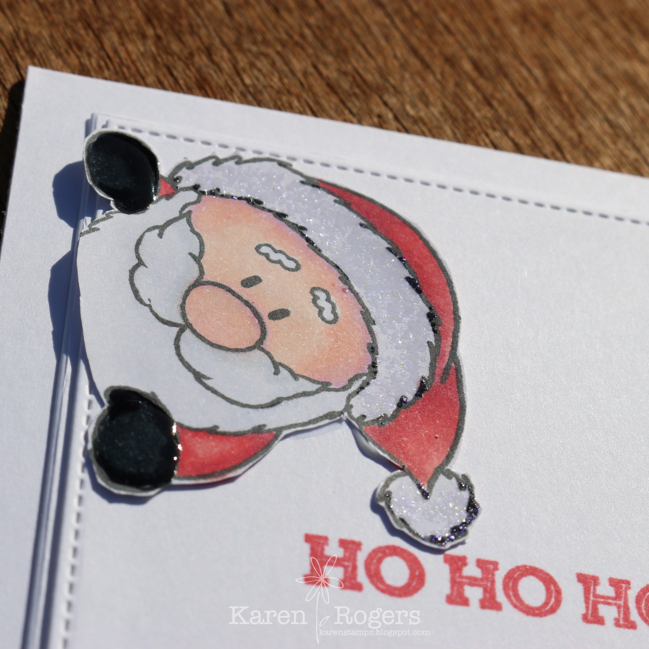
This was the card I created and I love it it's very feminine and delicate (this is the link to my original blog post for this card):


I coloured up the images using the coordinating stencils from Pinkfresh Studios using some of their lightest inks BUT I felt the colours were very light in comparison to what I was getting when I ink blended on my normal card stock I routinely use.

I then tried doing a Copic blend on the left-over pieces after die cutting out and it was weird, it was not a blend but more like a wet mess. I'm guessing this is what Copic blending on Yupo would be like.

The package insert for the Glimmer card stock says" create beautiful foil cards and projects with ease! This cardstock is also ideal for alcohol inks." Well this cardstock is not ideal for blending with Copic markers in my books. But it probably does work with alcohol ink.

When I got my machine I only had the Brighter Days hot foil plate and much to my surprise and delight 2 plates that came with the machine but I didn't own a sentiment set so I tried heat embossing with rose gold EP on the left-over paper as well and the paper curled. 

HMMM I was thinking to myself this paper is only going to be used for foiling sentiments when I get a sentiment hot foil set.

I then went off to SENZ (NZ's main papercrafting annual show) in Auckland and  managed to pick up two specialty papers that I did not previously own from Create Lavinia Multifarious Smooth & Supreme (330gm) and House of Paper Smooth White (300gm).

On my return home I decided I would cut up some small pieces of rose gold foil (this was also included with my machine by Spellbinders) and foil one of the foil plates that came with the machine which was a Happy Birthday sentiment. 

When I started blogging many moons ago I used to use a free program called GIMP to do something with White Balance and looking at my photos maybe I should try and remember how I did that but hopefully you see what I see. White does not photo great especially when it's wet and gloomy outside.

I tried foiling the Spellbinders Glimmer paper first as I loved it so much last time and much to my surprise and horror it doesn't actually look that good this time around. It's not horrible it's just not great.

I'm now going to show you what I consider horrible foiling first; starting of with the Lavinia Quality Smooth card stock - it is the worst of all the papers I think for foiling on. Hopefully it's nice for blending or stamping on!

Simon Says Stamp (120lb): a year ago (before Hammermill became the "it" card stock) Yana Smakula said this was her favourite. It's certainly not my favourite. The difference may also be to do with the pressure of our embossing machines but I was not impressed.

Basic White (thin/normal) card stock from Stampin' Up!:

Xpress-IT Blending Card stock - what I use for my Copic colouring:

Shimmery White (Stampin' Up!) what the SU! demos seem to like to blend on as it's smooth:

Thick Whisper White (SU!):

Neenah Classic Crest (Crafters Companion) 216gm - I bought this from England when I first started Copic colouring before I discovered Xpress-IT blending card stock. I think this is the equivalent of what the Americans call 80 1b weight, well it's not as thick as my 110 one I also have.


Thank heavens this was not the order I foiled in or I would have been really, really depressed or ordering Hammermill from SSS ASAP!

House of Paper was actually quite nice (the second half image which I did with a scrap of foil on the desk I used an extra shim and I think it has potential, so it and Spellbinders require some more testing.

Now something I still have 1/2 pack left and my girlfriend says she has a full pack the original thin Whisper White from Stampin' Up! which we were always told had more cotton it which is why SU! said it stamped better, actually foils not too badly.


Last but not least MY TWO FAVOURITES which both foiled beautifully:

Strathmore Bristol Smooth cardstock that you can buy from Gordon Harris or from Krafters Cart ($20), now this paper is fab for blending on with distress oxides and Zig real color brush markers etc. 

 and Neenah Classic Crest 110 1b which I also bought from Krafters Cart.


You can tell when something foils beautifully as you have this crisp outline from where the foil has been removed. (PS white photos better when it has another colour I can see - it actually looks white).

Well that was a really, really long post and I hope you lasted to the end to see what was good. This is what happened with my machine and my Big Shot so this may not be what happens in your machine but may give you an idea where to start experimenting.

✿ Karen ✿

I'm trying Colour Blocking again

Colour blocking was one of the cool techniques I learnt recently at Online Card Classes Spring Camp 2022.

I thought it was a really effective use of colour and would be a perfect technique for Just Add Ink's colour challenge this week. They're really dreamy colours and a great colour combo to tuck away for future use. 

I've seen some  YouTubers making colour swatches of colour combos they like which is a great idea and I'm going to start my own swatch tag using this colour combo!


Now the tricky thing with this technique is being able to read your ruler right I thought to start off with 1/16" was 1/8" but my partner Pete helped me get it sorted out!!

When I did my class we were given a template to follow which was for the front of the card but I like drawing on the back of my cardstock so I don't have to rub out the pencil marks so have drawn it up for what you draw on the reverse of your card front.


Supply List:
Stamps: Perfect Sentiments (PF)
Ink: Starry Sky (SU!)
Paper: Mint Macaron (SU!), Fresh Freesia (SU!), Starry Sky (SU!), Neenah White (#110), Vellum Paper (SU!)
Dies: Perfect Sentiments (PF), Hexagon Tile coverplate (PF), Forever Flourishing (SU!)
Other: 2021-2023 In-Color Jewels (SU!), mini stampin' dimensionals

If you interested this is the link to the card I KReated whilst doing my classes. Thanks for popping in.
✿ Karen ✿

23 July 2022

More Christmas in July

And more playing with my Gerda Steiner Designs stamp set Peeking Friends.

I've used the Santa from the set for CAS Christmas (Santa) and Less is More (traditional colours) Card Challenges.

I've Copic coloured up my image on Xpress-It blending card stock and used the following combos to colour him up.

Face: V12, E00/93
Red: R32/35/46
Mittens: 100/C8/10
Whiskers: C00/0/1/2

I have also covered the mittens with Nuvo Crystal Glaze so they look real shiny and I have used a Versamarker pen and then WOW clear hologram sparkle on the hat's fur and pom pom.  See the picture below, hopefully you can see a bit of shine and sparkle.


I have also used my Gina K Masters Layout 2 for the lovely card panels in the middle. I love them I could not cut out that straight or that precise and am very happy with that purchase.


I have stamped the sentiment from an old retired SU! stamp set called Oh, Goodie using the new in-colour Sweet Sorbet.


Again I'm really liking my normal tag stamp images on a card! Here's a link to when I mass produced a pile of tags using the elf from the set. 

Happy to report that my card was ShowCASed at Less is More
✿ Karen ✿

22 July 2022

Start of Christmas in July

Are you one of those people that are still starting your Christmas cards come December 1st, if you are I challenge you to join me in some of the Christmas in July challenges that are happening in various challenge sites.

AAA Cards are challenging us to use Christmas Pets this July.

 I felt like the only stamp set I owned that was appropriate was the adorable Peeking Friends from Gerda Steiner Designs as it is not too big so I could keep it CAS and the stamp set had Christmas hats like the picture.


Supply List:
Stamp: Peeking Friends (GSD)
Ink: Versafine Clair Nocturne
Paper: Neenah Solar White, Bristol Strathmore Smooth, Here Comes Santa DSP (Doodlebug)
Die: Square peek/boo window (MFT)
Zigs Real Color Brush Markers: Blender, Beige, Brown, Pale Pink
Karin Marker: Fire Red
Other: Water brush pen, Stardust Stickles, mini stampin' dimesionals
Challenge: AAA Cards Challenge #219


I'm loving all the Christmas Challenges at this rate I will have my Christmas cards KReated by September!!!! The DT loved my card too and I was chosen in the top 3 this week.


✿ Karen ✿

21 July 2022

Kids Kard Challenge

I have to say being a Karen and trying to be a KReative person because of my name I like a challenge that changes words to start with the LETTER K!

 So I was very excited to see the challenges at The Paper Players and Addicted to CAS are all about Kids and CAS. Congratulation to The Paper Players on their 600th Challenge too!

The hardest thing is choosing what image to use. I picked up my first Colorado Craft Company stamp and matching die whilst up in Auckland for the weekend. I have been meaning to buy a stamp from CCC for ages as their stamps are just adorable, but they normally are centered around mice. So I saw this wee cutie and  it had a cat so I was sold. 


I really enjoyed doing the  "calico-coloured" cat recently so  thought I would do something similar but it ended up being a tabby cat. I regret deciding I wanted to do no-line colouring so ended up going over the image with my Polychromo Burnt Sienna pencil to give it a bit of definition.

Now as this card is for kids it definitely had to have sparkle and jewels and I tried to cover up one of my raindrops I decided I didn't want but Hero Arts glitter paste is too sticky so next time leave alone or mask off my stencil!! The raindrops are created by mixing my HA glitter paste and some ink I smooshed from my Tumbled Glass distress oxide pad,  Hopefully the rest is obvious.


And showing off my Wink of Stella on the watering can.


Supply List:
Stamps: Mini Watering Can by Anita Jeram (CCC), Look for Rainbows (Avery Elle)
Ink: Memento Desert Sand, Versafine Onyx Black, Tumbles Glass distress oxide
Paper: Xpress-IT blending card, Neenah Solar white
Dies: Mini Watering Can by Anita Jeram (CCC), Master Layouts 2 (GK) - banner die
Other: Raindrops stencil (SSS), Ocean Breeze jewels (PF), Glitter Hero Paste (HA), clear Wink of Stella, Burnt Sienna Polychromo, mini stampin' dimensionals
Challenges: The Paper Players #600, Addicted to CAS #224

Copics Used:
Cat:E11/40/41/42/43; R30; YR20/21
Watering Can: BG10/11/13; Y35/38; RV66
Puddles: BG0000; B00/02


✿ Karen ✿

20 July 2022

Blast from the past

It's been a very long time since I stamped for real with a wood block stamp, I still have some cute Penny Black ones that I stamp with my grand daughter Indie but she likes the MISTI, so we normally use that.

But AAA birthday challenge has a "where in the world am I challenge" and CAS on Friday has challenged us to do a silhouette.


So back to my very old stamp I picked it up at SENZ a long time ago (pre MISTI) and it's created by Clinton Hawes @Rubbadubbadoo in 2005 and labelled A154T. To me its NZ's native grass the toi toi and I have always wanted to use it on a Silhouette card but never got around to doing it until today!

I used Scattered Straw, Picked Raspberry and Dusty Concord distress oxides to make my sunset blend and I have emboss resisted the stamp with Versafine black ink and clear embossing powder. The rest is pretty obvious but any questions don't hesitate to ask below. 

This was such an easy card to put together I wonder why it's taken me so long to ink it up and make my Silhouette card but very glad I finally have done so.


EDITED: My card was chosen in the "top 3" this week.


✿ Karen ✿